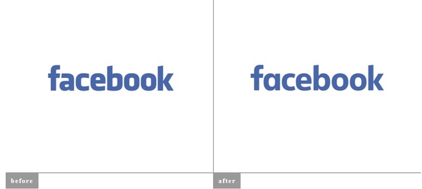
"When Facebook's logo was first created in 2005, the company was just getting started and we wanted the logo to feel grown up and to be taken seriously. Now that we are established, we set out to modernize the logo to make it feel more friendly and approachable. While we explored many directions, ultimately we decided that we only needed an update, and not a full redesign. We worked with Eric Olson -- whose typeface Klavika was used in the original logo -- and developed a custom typeface to reflect where we are now and where we are headed," said the company.
Most of the changes are very subtle including the double-story "A" now being single-story, but otherwise the logo is relatively the same with a more "grown up" presence.
Source:
Underconsideration
Written by: Andre Yoskowitz @ 3 Jul 2015 19:33
