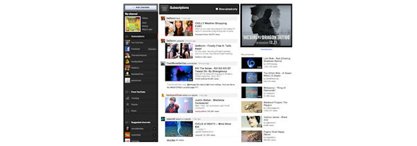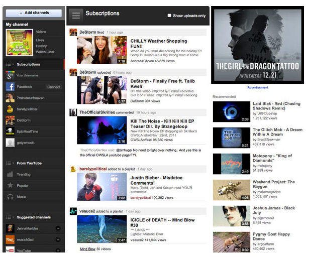
YouTube has introduced a new homepage and channel design today. Logged in users can now create their own personal, customizable YouTube Channel line-up, browse recommended channels based on their interests, link their YouTube account with Google+ and/or Facebook and customize their homepage feeds.
The online video giant also introduced an improved Channel design, focused on helping users find videos more easily. New Channel templates are aimed at casual uploaders who rarely add to their YouTube account, and also to users who have hundreds or thousands of videos for fans to wade through.
YouTube also applied a "fresh coat of digital paint" across the whole website, with a consistent gray background, bigger video thumbnails and a more streamlined watch page.

Written by: James Delahunty @ 1 Dec 2011 17:41


