Windows 8 Metro gets a new logo

Windows 8 Metro gets a new logo
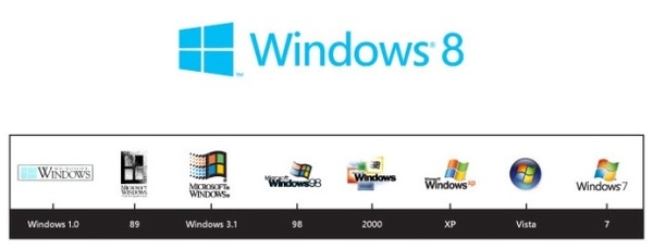
Microsoft has revealed a new logo today for Windows 8, one that features a single-color design and will be based on the Metro user interface.

The new logo has an angled window, which Microsoft says will give a sense of motion "aligning with the fast and fluid style you'll find throughout Windows 8."


Design consultants Pentagram came up with the new look, and the firm wanted to move away from the current logo which they believed looked more like a flag than an actual window. Says Microsoft of the decision: "'Windows' really is a beautiful metaphor for computing, and with the new logo we wanted to celebrate the idea of a window, in perspective."

Metro, which is part of Windows 8 for PCs and tablets, is touch-friendly and feature tiles rather than the icons connecting to apps that have been seen since the original Windows with GUI.

Windows 8 is expected to be available in the fall, with a consumer preview being released in the next month.


Written by: Andre Yoskowitz @ 17 Feb 2012 14:56
Tags
Logo Windows 8 Metro
Advertisement - News comments available below the ad
  • 10 comments
  • nbfreak2

    Dont care how it looks..HOW well does it function?

    17.2.2012 15:53 #1

  • ivymike

    Sill not convinced to buy it......Try harder, Microsoft.

    17.2.2012 16:35 #2

  • palwill

    the whole metro tile system looks like it was made for monkeys.

    17.2.2012 17:20 #3

  • defgod

    Originally posted by palwill: the whole metro tile system looks like it was made for monkeys. Yep they are pretty much dumbing down the OS with each new iteration. And I thought Windows 7 was bad.

    17.2.2012 18:53 #4

  • xaznboitx

    ugly logo

    17.2.2012 19:15 #5

  • 3MUK

    I wont judge until its finally released in its full form

    Always remember youre unique, just like everyone else.

    17.2.2012 20:56 #6

  • david94

    looks like an updates windows 1.0 logo to me

    18.2.2012 07:31 #7

  • molsen

    Originally posted by david94: looks like an updates windows 1.0 logo to me That is what I thought. Until I saw the time line, I knew I saw the logo before. Guess what is old is new again. Maybe like the GUI and frustration from 1.0 or even 3.0.

    18.2.2012 12:27 #8

  • LordRuss

    Great, a blase' design taking up a maximum amount of space with a aqua blue color reminiscent of the similar blue/green I see used all over Korean advertisements.

    I'm with everyone else. This had better be a solid release, with respectable operation or all hell is going to break loose again.

    http://onlyinrussellsworld.blogspot.com

    18.2.2012 14:01 #9

  • xnonsuchx

    Now they just need to add a new DirectX version for it that won't be available for previous versions to make gamers upgrade.

    Seriously, though, I hope they at least keep the registry setting to disable the horrific MetroUI. And as I've mentioned before, PLEASE put a true XP Classic mode in, as it totally sucks in Vista/7.

    18.2.2012 18:19 #10

© 2024 AfterDawn Oy

Hosted by
Powered by UpCloud