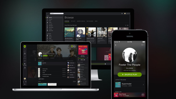
Spotify 1.0 has arrived and responded to user feedback with a darker new interface that will roll out across its services on every platform, starting today.
The new layout intends to make content the focus of our attention, as it "pops" out in its new dark surroundings. "Playing your favorite music has never looked so good," we are told.
In addition to turning the lights down, Spotify has also made some helpful feature changes. Your Music is a new way to browse and organize your favorite music tracks and albums. You can save albums and songs to your collection effortlessly, and create playlists that will suit your every mood and need.
In addition, Spotify has revamped its Browse feature so that it can serve up more localized, and relevant content for you.
The new design and features roll-out from today, April 2, across Desktop, iPhone and the web platform.
Competition heats up
Spotify may have been among the first to the game, and undoubtedly the first to make a lasting impression among ad-support streaming services, but with success eventually follows increasing competition.
In September of last year, Spotify gained its largest rival yet, with iTunes Radio adopting a similar model and building upon Apple's existing and iconic services. Apple has continued the roll-out of iTunes Radio, which is heading to the UK and more territories very soon.
Google's YouTube service is also rumored to be setting up its own service.
Still, Spotify has millions of users, and with continued improvements like those announced today, it should hold its ground.
Written by: James Delahunty @ 2 Apr 2014 9:11
