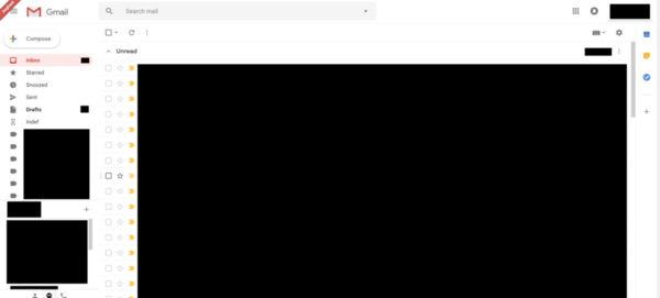
Gmail getting a revamp with a new interface, features from Inbox

Gmail getting a revamp with a new interface, features from Inbox
Google is planning to do a fairly meaningful user interface revamp to its beloved email service, Gmail, according to a leak by Android Authority. The renovation will include new features that have been used in Google's 2015 launched email service Inbox.

Among these updates Google will introduce smart answers and mute to Gmail, but perhaps more importantly user interface will get a refresh. Nothing major will change, as you might imagine, after all the companies don't want to fix what's not broken and thus no radical changes are usually expected.


Google will move Gmail's interface more towards its Material Design design philosophy most likely familiar from Android. This means turning some buttons into round bubbles and changing some colors, fonts and other minor elements.

Function-wise Gmail will retain everything you've gotten used to, and the bulk of options should be in their own usual places.

Leak doesn't have information when this update would be released but it might be as soon as Google I/O next month. Learn more about the leaked update at Android Authority.

Written by: Matti Robinson @ 12 Apr 2018 12:22
Tags
Google Inbox Gmail Google User Interface
Advertisement - News comments available below the ad
  • 2 comments
  • g_slide

    I've been using Gmail ever since my old Hotmail account was hacked about 10+ years ago.

    I can't stand Gmail User Interface as it looks like an old 1990 design. I wish they would improve the UI to look similar to Microsoft Outlook or even the new revamp Hotmail. Plus access settings and contacts should be in all one setting clickable location and not across the screen. It's just a really bad UI design.

    I hate Hotmail and like my Gmail account, but Google Gmail really needs to update the UI to look more modern.

    13.4.2018 14:48 #1

  • KillerBug

    Personally I like the current Gmail; it's nice and light weight without being so stripped you feel it. But then I think that the microsoft offerings have terrible, ugly UI's (they look like something from Windows 10...and I consider that to be a bad thing).

    As for offering settings and contacts (two unrelated things) in one section is the sort of thing I hate about modern UI's...they tend to make buttons bigger so there is less room for buttons so now you need to click two things to do what you could have done with one. Also...even if you have the screen space you still don't get all the buttons. You end up with a window that has lots of room for more but doesn't because they need the same thing to work on some old 800x600 tablet.

    14.4.2018 11:20 #2

© 2024 AfterDawn Oy

Hosted by
Powered by UpCloud