Evolution of Start Menu Search continues in Windows 8

Evolution of Start Menu Search continues in Windows 8
In Windows 8, Microsoft continues to refine the Start Menu search feature first introduced in Windows Vista according to the latest entry on the Building Windows 8 blog.

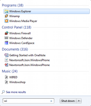
In Windows 7, Start Menu searching was expanded to include Control Panel apps and email messages and contacts. Since few email developers added support for this functionality, Windows 8 is dropping that feature.


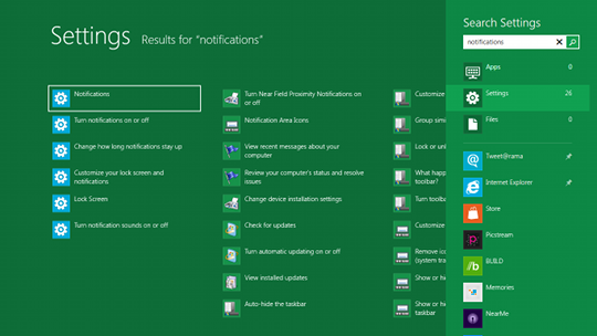
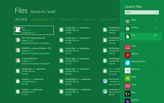
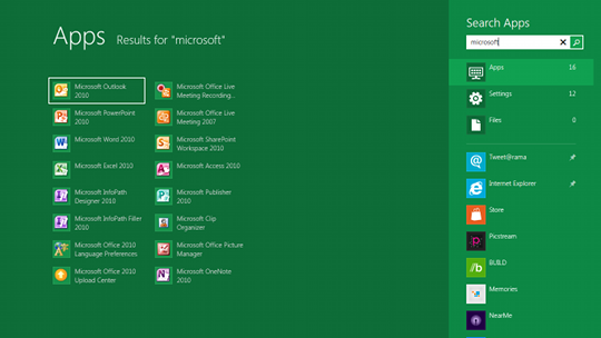
What you will get from the Start Menu Search in Windows 8 is the option to search for Apps, Settings, or Files. Also, unlike Windows 7, the results will all be displayed in the Start Menu, instead of having a 'See more results' option to see the complete list in Windows Explorer.


Essentially what they've done is expand Start Menu Search so it can fill the entire desktop. That way you don't need a separate window for viewing detailed results.

As with Windows 7, the most commonly accessed items will appear higher in the list.


Written by: Rich Fiscus @ 20 Oct 2011 1:58
Tags
Microsoft Windows 8 search Start Menu
Advertisement - News comments available below the ad
  • 4 comments
  • Linkdx

    now see, what if you share a computer with someone?... i don't think the most commonly used apps or items is a very useful thing :p

    20.10.2011 09:44 #1

  • neronut

    Thank you Microsoft for making Windows less efficient for everyone.

    Their new MetroUI is cool, on tablets and touchscreens. It is highly inefficient when using a traditional mouse and keyboard. They should detect the display type and adjust accordingly. Also allow the user to choose, if they want a start menu then allow them to have a start menu.

    20.10.2011 14:40 #2

  • Azuran

    Originally posted by Linkdx: now see, what if you share a computer with someone?... i don't think the most commonly used apps or items is a very useful thing :p That's what multiple logins are for.

    Originally posted by neronut: Thank you Microsoft for making Windows less efficient for everyone.

    Their new MetroUI is cool, on tablets and touchscreens. It is highly inefficient when using a traditional mouse and keyboard. They should detect the display type and adjust accordingly. Also allow the user to choose, if they want a start menu then allow them to have a start menu.
    I agree, although it might just be my distaste for change talking.

    20.10.2011 15:20 #3

  • BobShaft

    I definitely embraced Windows 7 when it came along. It may have only been a "refreshing" of the UI as compared to Vista, but it's performance and bug fixes made it well worth while.

    I've tried the early version on my laptop and although it's rough in it's current state, I haven't seen any features that would lead me to upgrade. Without a tablet or touch screen I just don't see advantages to the new interface.

    27.10.2011 09:51 #4

© 2024 AfterDawn Oy

Hosted by
Powered by UpCloud