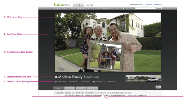
Additionally, the update will bring some design changes. The name of the show, episode title, runtime and other details will be moved under the video player and the area behind the video player will be made darker.
With the update also comes the removal of some features, however. The "dim the lights" option is removed and the ability to pop out the video player to its own window have been moved into the "more" section.
Says Hulu: "While watching Hulu on your browser today, you may have noticed something different. Dwight Shrute's head appears bigger, Sue Sylvester's tracksuit seems starchier and Phil Dunphy's parenting just got cooler.
I'm pleased to present to you our beautiful, new Hulu video player. Your favorite shows just got bigger.
Today, we replaced our old video player with an update that's 55% larger. It has a new frame and a drop shadow and sits on top of a large, dark gray video matte for easy viewing. We moved all of the video details below the player and cleaned up the pattern and style for a cleaner, crisper look."
Written by: Andre Yoskowitz @ 15 Mar 2012 21:08
