Back in June, Microsoft unveiled the Surface tablets, one based on the popular ARM architecture seen in most tablets and smartphones and one based on the standard Intel/AMD x86/x64 architecture seen in nearly all PCs. The first to be released is the ARM-based device, which features its own form of Windows 8 dubbed Windows RT.
The device is priced equal to the Apple iPad and higher-end Android tablets but it is being branded as more than just a tablet, it is being branded as a desktop/laptop replacement.
In this review, we will discover if Microsoft has lived up to that promise.
Specs and Design
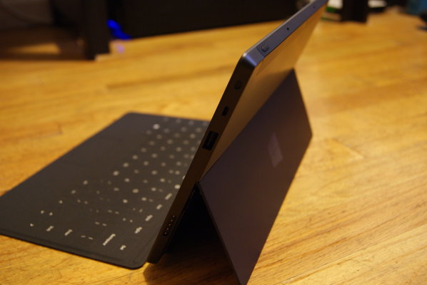
I'll say this outright; the Surface's design is one of the nicest I've ever seen on a tablet. The company used a magnesium alloy for the entire body of the tablet, which gives the device an extremely sturdy and sleek look.
From all angles, the device has a sharp look, with neatly placed buttons, a Microsoft logo and a small strip of plastic to house the rear-facing camera. The kickstand is the same color and has an enjoyable "woosh" noise and click letting you know it's not just some cheap piece of plastic.
On the front, the glass screen is massive, and there is little else but some bezel, a front-side HD camera and the capacitive Windows button in the center which takes you back to Live Tile mode when you are in desktop mode. For some reason the MicroSD slot is hidden under the kickstand, but at least there is one unlike other tablet.
Perhaps most annoying of the design is the proprietary charging port, which is magnetic but doesn't necessarily work well, at all. Microsoft should have opted for a standard charging port.
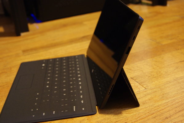
The tablet is somewhat heavy, (or at least it feels that way), for something that weighs just 1.5 pounds. It is also very large. The dimensions are 10.81 x 6.77 x 0.37 inches, with the display being a workable 10.6 inches, larger than any other popular tablet on the market, most of which feature 9.7-inches or 10.1. That being said, Microsoft seems to have created the tablet to be docked with a keyboard, rather than being a comfortable tablet experience. This is unfortunate because trying to use the kickstand on unsturdy surfaces was an effort in futility for the most part. If you don't plan to use the cover as an actual keyboard, the on-screen keyboard works as you would expect it to, very well. Better so, than iOS', in my opinion, but not as good as a Jelly Bean packing Android device.
On the design side, the tablet is gorgeous, especially when compared to tablets like the Kindle HD Fire and Nexus 7. The design and feel live up to the iPad, and that is saying a lot. However, the size of the tablet begs for a desk and a dock, taking away some of the fun of having an actual tablet.
Under the hood, the tablet is powerful. There is a quad-core NVIDIA Tegra 3 T30, 2GB of RAM, 802.11a/b/g/n Wi-Fi and Bluetooth 4.0, 32 or 64GB of internal storage, capacitive pen support, an ambient light sensor, accelerometer, gyroscope, and compass. The specs are nice, simple as that.
Display
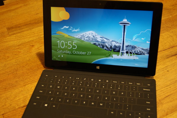
The Surface features a 10.6 inch ClearType display running at 1366 x 768 with 5 point multi-touch. The display is 16:9, making landscape the preferred way to use the tablet. In fact, trying in portrait is actually pretty awkward.
Microsoft's own ClearType tech is supposed to make colors crispy, as well as the typography, even though the resolution is not huge like the iPad's Retina Display or other 1080p displays. The tech lives up to its hype, as the screen is fantastic on the Surface. The blacks are black and the colors are extremely rich and crisp. However, a screen of this size needs at least 1080p and it's not there.
Touch response was fantastic, although Microsoft made some mistakes with the software, like X-ing out of some windows in desktop mode were harder than they should have been due to being too small for accurate touch. The multitouch and gestures all worked as they should, as well.
Cameras
The Surface features dual cameras, both being 720p. There is no flash, or autofocus, and taking pictures with a tablet this size is nonsensical. For Skype and video, the cameras worked just fine, and the tablet's size came in handy at that point. Otherwise, the pictures were very low resolution and extremely grainy. It's nice the tablet has two cameras, but outside of Skype, they are pretty useless.
Battery Life and Performance
Battery life was awesome. For average use including Web browsing, some video watching, some Skype chatting and a bunch of Twitter checking, I was still able to get over 8 hours. The battery life was similar to that of the iPad, which is a good thing. This can be attributed to the optimization for ARM, and battery life will likely suffer a bit when the Intel-based Surface Pro comes out next year. However, battery life was very impressive with the Surface RT, as promised.
I had no issues with the performance of the tablet, as a whole. The UI was very responsive, and the Live Tile interface was really, really fast and efficient. The startup was a bit slower than I expected, but that could be me being spoiled by Jelly Bean.
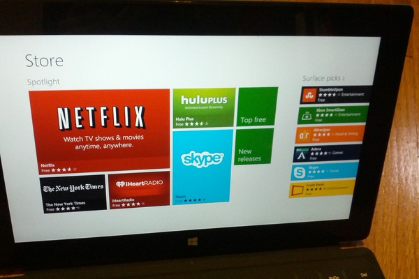
All of Microsoft's apps were great, with the exception of the Games and Store live tiles, which seemed to hang forever when opening, for no reason. The Mail app seemed slow at first with only Gmail and Live connected, but I have had no issues since the very beginning. I have not tried too many third-party apps of yet, but most have worked very decently, including Hulu Plus and Netflix, although the playback quality was not perfect, yet.
The Surface did not like Flash video while in Internet Explorer 10, nor did it like some HTML 5. However, this was not a big problem as general performance was very good, if not without bugs.
Software and Ecosystem
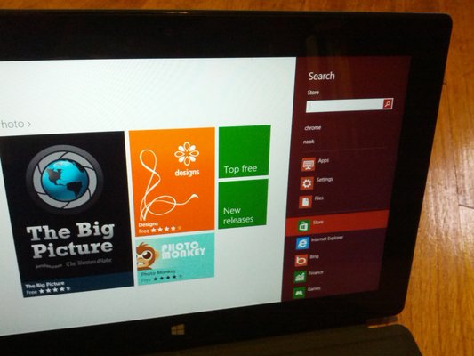
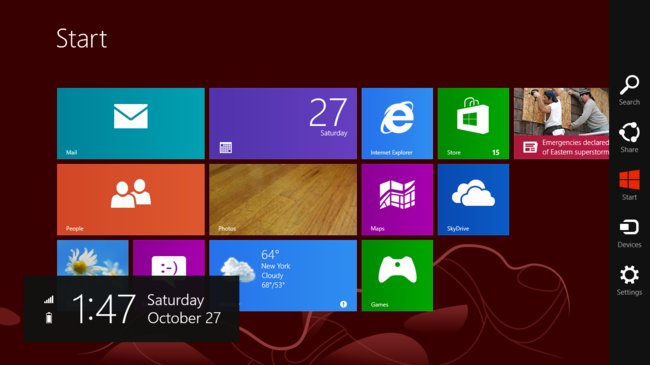
Windows RT itself is awesome. The Live Tile interface is great, in my opinion, and it is very easy to get to Desktop mode or any application you are looking for. It's also very easy to re-arrange your apps to match your needs. There are Windows power tools, as well, and of course, there is Paint, which is actually pretty fun to use on a tablet.
The OS in desktop mode is almost exactly like using a standard Windows 7 machine except that there is no Start bubble. If you can get over that fact, that the OS runs through the tile interface, it is very aesthetically pleasing and usually a joy to use.
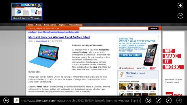
Internet Explorer works in full desktop mode as it would were you using a computer, and works more like the Windows Phone version of itself when in the tile mode.
All of the apps are decently intuitive, but Microsoft really does not make it their priority to explain how things work, especially those that require gestures. This may not sit well with all consumers.
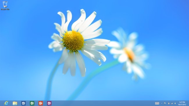
The Office Preview, while we wait for the full release next quarter, is great. It is everything you expect from a productivity suite, and is much better than alternatives on Android and iOS like QuickOffice HD. Microsoft knows this and exploits it well, tabbing the programs in Desktop Mode and making them Live Tiles right out of the box.
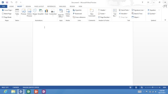
Despite being a complete joy to use, Windows RT may actually be the downfall of the tablet. Microsoft has placed draconian restrictions on the operating system, including blocking other browsers that are not Internet Explorer. For someone who uses Chrome and syncs Chrome across all their existing devices, this is just not acceptable. Additionally, Windows RT cannot use the hundreds of thousands of Windows apps that previous OS owners enjoy. You can only download and use games created for Windows RT and its Metro style. For now, the app and game catalog is small and while it will improve over time, there is no incentive for rivals like Google to make their popular apps like Google Music, Drive, etc. available on the Surface RT anytime soon.
These restrictions make you feel blocked out, and completely breaks Microsoft's promise of the tablet being a desktop/laptop replacement, which is unfortunate. Another thing to keep note of is, your 32GB Surface, because it is running Windows, will actually give you just about 16GB of actual space on first boot, which is disappointing.
Touch Cover
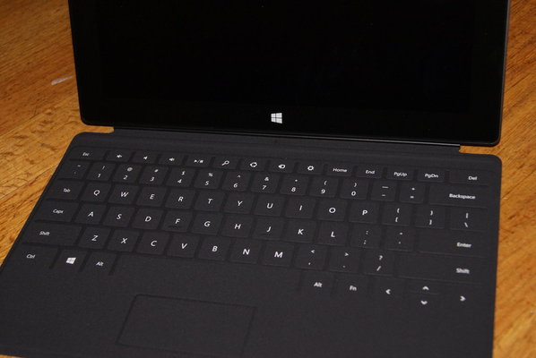
The Touch Cover is brilliant. The cover connects very easily, and magnetically, to the bottom of the tablet and doubles as a full keyboard and protective cover. It works extremely well as both, as well. Despite not having actual movable keys, typing was easy although not "satisfying." I found myself checking what I had written more than usual to make sure there were no mistakes although there were rarely any. The mouse touchpad also worked shockingly well, moving wherever I moved it with no lag.
The main issue with the cover is using it anywhere that isn't flat or sturdy. Trying to write while on a train was hard due to the tablet being much heavier than the Touch cover and having to try to hold down the keyboard while typing with the other hand. Not fun.
All that being said, however, I would recommend getting either the Touch cover or the Type cover if purchasing a Surface as it enhances the experience significantly.
Conclusion
I had extremely high hopes for the Surface, as I have been looking to replace my current ultrabook with a tablet hybrid that has superior battery life, a touchscreen, and can also live up to the productivity needs of my everyday life.
The Surface with RT is a fantastic tablet, with one fatal flaw, and that is RT itself. While I thoroughly enjoyed using Windows RT, and see huge things for Windows 8 moving forward, it became a dealbreaker when I was not able to use established apps I use regularly on my Windows 7 ultrabook or even apps that I use regularly on my Android or iOS devices. I loved the familiarity of Windows, the controls of Windows, and the new interface Microsoft introduced is fantastic. Unfortunately, the lack of legacy applications makes that moot.
Despite a fantastic design, the tablet is large, which makes regular tablet activities somewhat of a pain, as well.
Overall, the Surface with RT gives me even higher hopes for the upcoming Surface Pro, which will run on an Intel chip and will have support for all legacy Windows apps. This tablet, despite being heavier, I believe will be a game changer in the market, as long as Microsoft doesn't price it out of the range (which is entirely possible). Unfortunately, we have to wait until next year.
Design 9/10
Display 8.5/10
Battery Life 10/10
Performance 8/10
Software 8/10
Ecosystem 4/10
Total: 8/10
Written by: Andre Yoskowitz @ 27 Oct 2012 17:47

