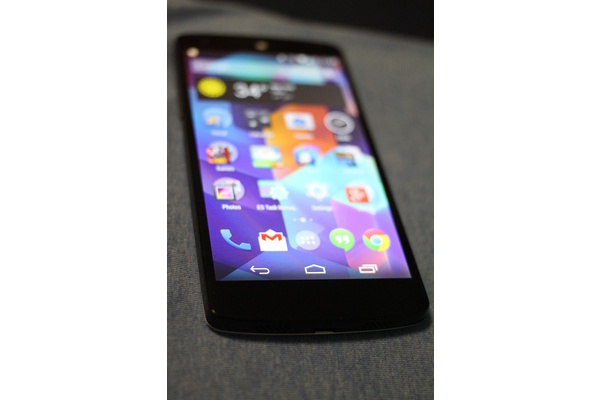
The device sold out of initial supply through the Google Play Store within hours and moved to expected one week shipping and then two week shipping before the launch day was completed. The experience was significantly better than the Nexus 4 launch, which saw server crashes and delays and shipping times as long as 10 weeks.
I've been able to test the new reference device for about a week now, and the question is not whether it is the best phone in its price range (which it certainly is), but whether it can compete with the best-in-class devices such as the iPhone 5S, Lumia 1020, HTC One, Galaxy S4 and some would argue, the Note III.
Specs and Design
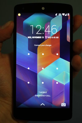
From a specs standpoint, the device is a powerhouse. The device has a Full HD IPS 4.95" 1920x1080 display (445 ppi) protected by Gorilla Glass 3, runs on the brand new Android 4.4 KitKat and is powered by a Qualcomm Snapdragon 800 at 2.3GHz, 2GB RAM, and an Adreno 330 GPU. There is a 1.3MP front facing camera, an 8MP rear facing camera with Optical Image Stabilization, a 2,300 mAH battery and wireless charging capabilities.
As is the trend, the phone keeps on getting thinner and lighter, weighing in at just 4.59 oz and 8.6 millimeters thick. In addition, the LTE-capable device also has dual-band Wi-Fi (2.4G/5G) 802.11 a/b/g/n/ac, NFC (Android Beam), Bluetooth 4.0 LE, and a micro USB port with SlimPort enabled for full connectivity options. The phone is incredibly light for its size.
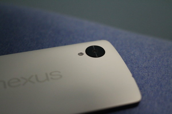
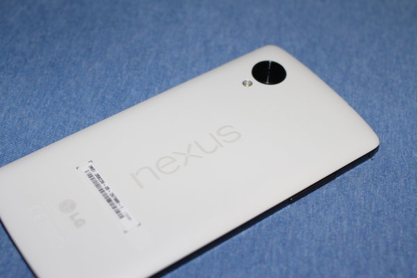
From a design standpoint, the phone is made entirely of plastic, which admittedly does not give it the same "premium" feel of the iPhone 5S or the HTC One, but it certainly does not feel cheap. The phone has tiny bezels, rounded edges for good ergonomics and is very comfortable for use with one hand or two, despite being a large phone at over 5 inches tall. The backplate is available in either white or black, and the style is 'stickier' than the Nexus 4 and its entirely glass black, which slid every which way and was annoying to keep on surfaces that weren't perfectly flat. The volume rocker and power button are made of ceramic (or equivalent) and everything is placed exactly where they should be, naturally where your hand grabs the device.
There are two grilled speakers to the side of the standard micro USB port, one of which is a real speaker and the other is the mic. The grilled earpiece is right in the center of the top bezel, and it is white (if you have the white/black model), which stands out and isn't particularly attractive. On the back of the phone, Google has etched the word "Nexus" and added a large black ring around the camera which is actually so big it portrudes from the back. It is a somewhat strange addition to the phone, but it certainly 'different' and that may have been what Google and LG were trying for.
Overall, despite its plastic feel, I am very happy with the design of the Nexus 5, especially its ergonomics, button placement, thin bezels, and somewhat shocking lightness.
Display and Performance
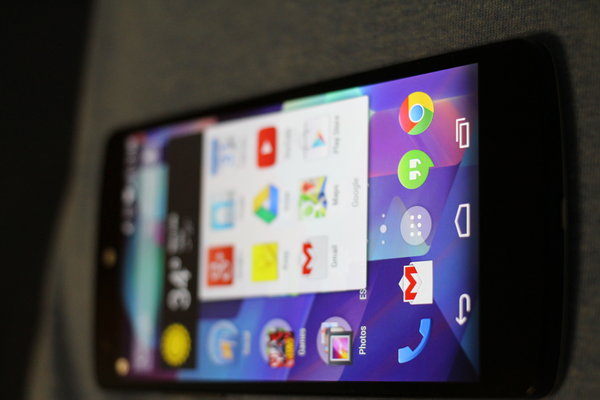
The Full HD IPS 4.95" 1920x1080 display with 445 ppi is in a word, fantastic. The display is very bright, saturation is great, colors are accurate and everything is clear. The extra screen space (moving up from the slightly smaller Nexus 4) is also noticeable and reading, viewing all types of websites and video are a joy.
Google made the display the centerpiece of the entire device, and your portal into the world of Android. It pays off in this case.
Performance for the Nexus 5 is extremely snappy. The Snapdragon 800 quad-core processor is the best chip on the market today (although Intel or Apple may beg to differ) and the Adreno 330 GPU makes gaming and multitasking a breeze.
Basic scrolling between windows, apps, and other services has no lag, and the animations Google has been working on with Jelly Bean and beyond are almost perfected now. The performance of the Nexus 5 is top notch and matches if not exceeds other top models available.
Battery life was also better than expected. With moderate use, the phone got me through the day, and on average, 3 hours of screen-on time was about what drained the battery, especially when connected to LTE. I was very disappointed by the Nexus 4 battery life, and the Nexus 5 cannot compare with the iPhone either, but it was not as terrible as expected given only the slight boost to a 2300mAh capacity battery.
Cameras

Normally, I don't care too much about the cameras on my smartphone, but Google has already admitted they are working on a software fix for the Nexus 5's cameras so it is clear that someone dropped the ball when it came to the new flagship.
Featuring an 8MP rear camera, a nice step up from the 5MP shooter on the Nexus 4, the device can certainly take nice clear pictures, but it isn't consistent, at all. The biggest issue I have had is with the auto-focus, which seemingly takes forever to find the correct target (if it does at all) and Google shockingly removed instant shutter, so the actual picture taking once you've focused is slower than it should be.
Colors and contrast are poor, and photos seem blurry unless taken perfectly. Compared to the new iPhone 5S and the Lumia 1020, the camera certainly does not compete. Google says they are working on a fix for the software side, which is an acceptance that the hardware is there, but the integration was not properly executed. Expect the fix within weeks.
Software and Ecosystem
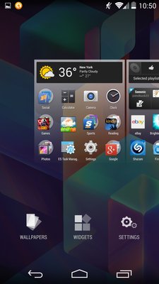
The Nexus devices are built, really, for one reason; to showcase the latest and greatest version of the Android operating system. The Nexus 5 features Android 4.4 KitKat, which has significant updates and feature changes from its predecessors.
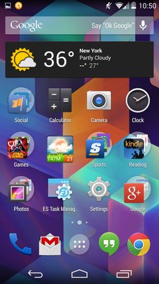
Aesthetically, the OS looks mostly the same, but Google has lightened everything up when compared to earlier iterations of Jelly Bean. Google moved to turn the trim of most icons and features white, including the background of folders which were previously transparent. Android 4.3 and earlier were "darker," but KitKat goes the other way, and is much lighter and more colorful. The taskbar up top now has a transparent background, as does the home/back/apps buttons, allowing for easier integration.
The apps are larger, the icons are cleaner, and widgets are more efficient.
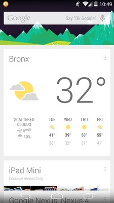
Google's scarily effective Google Now now has a dedicated home page window. All you have to do is swipe left to get to Google now, much easier than holding the app drawer button and gesturing upwards as you had to do previously. Google Voice Search is also better integrated, and you can say "okay Google" to get started when you are on your home page.
Additionally, Google has completely revamped the dialer, which goes hand in hand with their overhaul of the "People" contact manager. Unfortunately, it now has a bit of a bigger learning curve compared to past operating systems but easy to pick up. Favorites and recently dialed can be shuffled and placed in order how you like it, and autofill for the dialer is quick and efficient.
Google did away with the widget drawer, and instead replaced its own menu. Long pressing anywhere on the launcher pages opens up all available homepages in a zoomed out mode, a wallpaper menu, widgets menu and settings, as well. Google also added printing ability from your phone.
Another very major change is the update to the messaging app and the Hangouts app. Hangouts, previously for Google chat and Google+ messaging, is now the only app for sending any kind of message, including SMS and MMS. With the new Hangouts, you can see all of your contacts in one place, and send texts, instant messages, start audio and video calls, and send attachments.
The new Hangouts needs some work, but it is a very good start in having a unified messaging system. Group chats/messages are hugely improved, especially when speaking with iOS owners. Sending attachments are oddly harder to do now, but I am positive that will be fixed in the next marginal Android update, 4.4.1 perhaps? KitKat is great, if not without its issues, but Google proves once again it is leading the pack with innovation for mobile operating systems and the standard bearer that everyone else is trying to catch up to.
Final Thoughts
Google has taken the next step in their references devices, but it has yet to perfect its smartphones. Android KitKat is the first step in Google's effort to integrate everything you do, and it does not take this task lightly.
Performance is fantastic, the display is gorgeous and I am a fan of the design, although it is rather on the plain plastic side. The cameras need work, as does some of the new kinks in Android 4.4, but I have no doubt these will be fixed.
Overall, Google has created a great phone, and at the price tag of $349 off-contract, it is certainly worth the price tag.
Design 7.5/10
Display 10/10
Battery Life 7.5/10
Performance 9/10
Software 7.5/10 (gets a dip due to cameras)
Ecosystem 9.5/10
Total: 8.6/10
Written by: Andre Yoskowitz @ 13 Nov 2013 6:00

