Leaked shots of Metro-style Hotmail posted

Leaked shots of Metro-style Hotmail posted
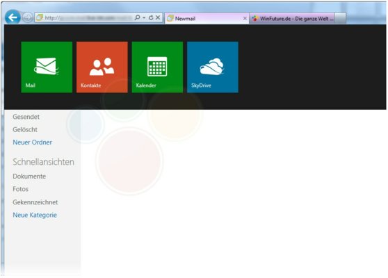
Following a couple days of rumors, a leaked shot of the upcoming Metro-style Hotmail redesign has emerged.

Via the German site WinFuture, the first screenshot is here, showing off a redesign that fits pretty well with the Metro interface we have grown accustomed to through Windows 8 previews.


If accurate, the design shows colorful flat backgrounds and tile-style icons for Mail, Calendar, Skydrive and Contacts.

There is also said to be a full vertical bar that is currently blank and can't be viewed in the shots.

Windows 8 is expected to be released in October.


Written by: Andre Yoskowitz @ 8 Jun 2012 12:41
Tags
Hotmail Windows 8 Metro
Advertisement - News comments available below the ad
  • 12 comments
  • dEwMe

    Wow I gotta say I don't care for it at all. Not at all interested in Windows 8...Fully expect another WinME or Vista style mess. Long live Win 7!

    Just my $0.02,

    dEwMe

    8.6.2012 13:42 #1

  • 1nsan3

    yea, windows 8 is gonna suck, and now there gonna try to make there website look pathetic also lol.

    For Sale:

    Parachute, Used Once, never opened small stain.
    Best Offer!

    8.6.2012 17:22 #2

  • ThePastor

    Good god, Metro is ugly.
    I said it when I saw Win8 and now here... this thing just blows.
    How could anyone want that?
    What's with the block colors? Put some actual design to it!

    Oh, Im sorry... Did the middle of my sentence interrupt the beginning of yours?

    8.6.2012 18:14 #3

  • DVDBack23

    Originally posted by ThePastor: Good god, Metro is ugly.
    I said it when I saw Win8 and now here... this thing just blows.
    How could anyone want that?
    What's with the block colors? Put some actual design to it!
    It's "minimalist."

    8.6.2012 18:15 #4

  • A5J4DX

    not bad but not needed i say

    8.6.2012 19:28 #5

  • bigdan45

    Metro is bullshit!!! I'm stickin' with Windows 7 until they learn otherwise and get rid of this metro crap.

    8.6.2012 21:02 #6

  • squijello

    It looks extremely cool. I'm not sure why everyone hates on anything that looks different than they're used to...

    9.6.2012 08:02 #7

  • Bozobub

    Originally posted by squijello: It looks extremely cool. I'm not sure why everyone hates on anything that looks different than they're used to... Squijello, a lot of what people dislike about "Metro" is the enforced "dumbing-down" of the interface. If you're not using a touch-based device, Metro is an impediment to using the PC.

    M$ has always been prone to falling into this trap; the ribbon menus of Office 2010 are a great example. They LOOK kinda purty, but productivity drops through the floor as people have to re-learn an entire interface for no good reason. Ask most people who've used both types, and 80% or more STILL hate it.

    9.6.2012 13:12 #8

  • ddp

    squijello, there is an old saying "if it ain't broke, why fix it".

    9.6.2012 13:27 #9

  • squijello

    Originally posted by ddp: squijello, there is an old saying "if it ain't broke, why fix it". while I would agree in most areas, that "if it ain't broke, dont fix it"; to be competitive in the tech industry you simply cannot leave anything alone and expect to grow... it is this reason Apple has been able to take market share from microsoft... Microsoft is taking the lead this time and I know I do not speak for everyone, nor do I want to, that said, it is a good move imo.

    10.6.2012 10:34 #10

  • SuikoNiNjitZu

    i Can't Wait for Windows XF ( Experimental Final ) it's just Like Windows Xp everything works easily just a New GUI and directX flawless coding the way it's ment to be without some donkey screwing around with thing's just to tinker around because he's bored putting programs inside other programs under a program

    Tired of Freedom ZRape? El4ct RON PAUL!

    10.6.2012 12:15 #11

  • ddp

    SuikoNiNjitZu, fix your sig to conform to forum specs ASAP.

    10.6.2012 13:48 #12

© 2024 AfterDawn Oy

Hosted by
Powered by UpCloud